Saturday, April 23, 2011

Design Tips

This week I finally was able to get the burden of the presentation off my shoulders.
My main focus was a redesign project that I explained in one of my blogs (Before and After). Additionally, I provided some design tips on my own process. These are things that I keep in mind.
The visual for the presentation was a combination of our brand and a little of my own flare. I believe subliminally I realized that I was inspired by my juggling act at work.
I decided to cover six tips which really is a little broad because I did cover more than one point for each but I wanted to try to simplify the title.
1 – Brand
- Logo size and space surrounding it needs to be adequate, never embellish on the logo

2- White Space
- Summarize content
- Text too close to the edges becomes a problem (2 reasons trimming and reader obstructs text)
- Provide adequate space around an image
- Border overload - images and the page don’t need to have a border
- Keep text/images at least 3/8 of an inch away from the edge of the layout

3- Design Focus
- Decisions should be based on the target audience
- Time to listen to the client and ask questions

4- Color
- It’s non-verbal communication and creates an emotion
- Best used as a background element
- Colored body copy is difficult to read and printing it is more prone to registration issues unless it’s a spot color.
- Make the most of your color limitations by using screens of a spot color for varying tones and colored paper.
- Always keep your Audience in mind: Another factor to consider are those that are color blind.

5 - Fonts
- A design/message could be achieved by clever use of type without an image.
- Our responsibility is that it’s legible for the reader and that we respect the typeface we chose to employ.
- Use one typeface family for a layout more than 3 typefaces can make a page feel cluttered
- Keep body copy between 11 pt and 9.5 pt in size
- Distinguish content by importance. (What message should be large and read first and so on.)

6 - Photography
Taking photos:
- Photos of staff – check for any wardrobe issues: buttons, zippers, transparent material
- Not to close to a wall
- Get a permission form signed.

Using images:
- Some photographers only allow a limited number of years for the image than charge an extra fee to extend it. There are also fees for the application that it will be used on – such as National Magazine ads or billboard.)
- Directional use – where are the shoulders facing or the eyes this would be the appropriate place for the heading or key message
- Photography is key to the success of the layout

Many of these I'm sure that are on the top of the list for many designers but I hope a few were reminders or something new.

Sunday, April 17, 2011

Survivor Outreach Services Campaign

A campaign that comes to mind that I designed from conception to production is the Survivor Outreach Services (SOS) material.
SOS is an Army program that was developed to serve the Surviving Families of the Fallen and provides the long-term support, resources and emotional connections.
In the design process it was important that we keep the sensitive subject in mind. What is a survivor that has just lost a loved one going to be able to look at without being offended?

One of the main focuses for this material was to provide a sense of hope. In order to reinforce it I chose a color that symbolizes hope which is green. Then the marketing account manager and I decided to use images of survivors themselves. We decided to use hands as the main image used throughout the materials. The image we chose to use were two holding hands one of a child and another of an adult, it is what you would see when someone is being guided.
I don’t want to get spiritual because I like to respect everyone’s beliefs but there is scripture that states that we should become like children in our trust in God. So the image of the child’s hands has multiple meanings. It depends on how the viewer looks at it.
SOS Materials Developed

In the brochure, we provide the immediate information needed and faces of those that have experienced a loss their names are captioned with the year of survival. Hopefully the visual will provide a sense of not being alone as well as a place that can help. Other materials we created were cards, ads, bookmarkers, posters for the installation SOS offices, folder and more.
I’ll leave you with a video that really speaks to this program. Interestingly the seventeen year old that composed it also used green.  Click here to see the video "Remember Me".

Sunday, April 10, 2011

Rushing = Mistakes

Many of my freelance projects that I worked on were building campaigns. I shared a logo that I did for the United Cerebral Palsy Building Campaign in my blog “The Customer is always Right.”
This time I'll share the Holy Spirit Catholic Church Building Campaign. In general, I was happy with the materials on this project. Yet there was one particular mishap that I could have prevented.  I learned my lesson. Last minute changes need to be reviewed carefully prior to hitting send.

Brochure Cover - 14" x 11"
On the informational brochure (cover pictured) we had originally created a letter sized booklet that folded in half. The day the brochure had to go to the printer they decided more information was necessary so the layout was resized. This is where things went wrong. I made the size larger but I didn’t pay attention to how I had the document setup. Bottom-line we ended up with a super size booklet the client had to pay a special fee to bind the book.  The lesson learned was to always print out the piece and review. If I had, I could have avoided this mistake. Another lesson was to put the brakes on and have the client understand that the production needed to be delayed in order to be able to provide a quality piece.

Campaign Logo
Overall what inspired the look of the pieces of this campaign was the spiritual subject matter along with the illustration provided. Because the logo is the first item that is created it is the most influential piece for the creative of the other materials. The discussions that take place are noted for direction on the other items being created. Using the dove in the logo guided me  towards using dove grey color and from there I made the combination with the other colors. The images used were supplied by the parish allowing for the piece to be more personalized.  (Logo and Stationary pictured)


Campaign Stationary
A couple of days ago I was rushing around again and I remembered this project. I made sure I printed the Soldier Show poster before I hit send. I was so glad I did there were several things that needed to be corrected.

Sunday, April 3, 2011

"Before and After"

Lt: Original Design   Rt: New Product Design
I have been working on my presentation for the symposium. I will talk on “Graphic Design – from conception to production”.
There is a section that I will discuss a “Before and After” project.  In 2001, I was working for Protective Life Insurance Company in their Annuity Division. It is here that I had the perfect redesign project. 

The company was adding a new product to their variable annuity package. Along with the additional product it was decided to redesign the old variable annuity materials.  This product was originally designed with the visual of musical instruments (see cover image).  The two products were the same cover and colors so neither was easily distinguishable. In the redesign, I collaborated with the marketing manager and copywriter.
First of all the image for the cover (top left) that was used left much to be desired. It didn’t have much color and it was static.  The red-brown colored border on the inside pages and copy really wasn’t very attractive. I did like the idea of the line art images of an instrument placed inside the red-brown border; I did use this idea in the redesign.

Top Lt: Original Layout   Btm Rt: Redesign
 Our main goal was to make the information friendlier for the user. Our inspiration came from the idea of the musical aspect of the original design. When we developed the idea, Jazz music became the overall theme. The soothing feel of jazz also took over the look of the piece. Below are a few of the areas we improved.

• Used a different prominent color for each product to make each distinguishable visually
• Placed images of individuals that represented the target audience to make the information more approachable
• Designated one focal instrument per product. (To carry the Jazz mood I made the images Black and white and I spot colored the instrument.)
• Added colored bars along a chart of information to make it more legible (compare the inside pages pictured)
• Added Jazz themed “Pull quotes” to help break up the intimidating text.

I’ll leave you with one of the quotes we used in the booklet that I feel could apply to designers as well.
“Musicians don’t retire; they stop when there’s no more music in them.” 
- Louis Armstrong, Jazz Trumpeter

Sunday, March 27, 2011

Part III: Soldier Show Material


Original Version #7
The Soldier Show Saga continued this week. My supervisor’s boss gave me a call on Monday and she asked me “Why did we not provide the version that the client preferred the most?”

2011 Program Cover
I said “I’m confused about that myself but that is the guidance I was given.”  She told me to revisit the #7 version (pictured) and resubmit. The other feedback we received from the client was that they wanted blue to be the prominent color since last years’ was red (shown on the right).
I made the revisions and resubmitted three more versions (pictured below).  We are still waiting for a response and the timeline is getting short. I still have the poster and the layout of the program to but together. The first show is April 22nd; I believe it’s in Washington, DC. We expect to have direction by next Wednesday.

I have dabbled a little on the idea of what to do for the inside pages of the Soldier Show Program. It is a half letter layout so the pages do not allow for too many elements before it becomes cluttered. I am planning on using the stage design as the inspiration and use elements from the cover designs.
Another project I have is the material for the “Association of the United States Army” Conference that is coming up April 18 – 21. It will be held in downtown San Antonio. Thankfully the visuals have already been created it is a matter of reformatting them for the materials needed; several large banners and a tradeshow booth which comes to about 21items total. Luckily, I’ll be sharing the task with two other designers. I’ve also been asked to give two talks for the conference’s design and marketing sessions. It should be interesting and it is an honor to be asked to represent our creative services team. But In order to accomplish this I need to have a presentation put together and could use the time to prepare. 

Sunday, March 20, 2011

Part II: Soldier Show Concepts

I was given some direction this week on the Soldier Show Poster. I was informed that the client preferred posters #3 and 7. But #7 had the most votes.  Apparently the show has a circus-like appearance but they really didn’t like the idea of really showing any “personalities.” At least not the way I depicted them. The client wants more of a feel of the circus without showing anyone. At least that’s what I understood.


What is confusing is the following guidance that I received. I was instructed to modify #1, #2 and #6. The client didn’t pick any of those.  Number 1, I was to switch out the background of the first option with the one from #6. Number 2, I needed to change the silhouette of the ringmaster. The feather did not go over very well neither did the glasses which I was able to change. Number 3, I also had to create the versions as a cover design without all the text that the poster includes. Hopefully, this change would allow the client to get a better idea of the direction.  

My original idea was to get a “Cirque du Soleil” look and feel but honestly I don’t know that I’m doing the project justice at this point. When these “high profile” projects come up a parade of people have to be involved. This usually just complicates the process.

One of the benefits of this project unlike some of the ones I work with is that it does have a timeline. The Soldier Show's first presentation is at the end of April so we are rushing to get our approvals on the materials necessary to provide to the Installations. We will create print ads, electronic ads, posters and the show program.

You can see below the last three that were forwarded the first and third are very similar because of the same background. And so the process continues . . .


Sunday, March 13, 2011

Soldier Show Poster Concepts

This week was just as busy as the last one. Basically, it was another week of juggling multiple tasks along with the “walk-in” requests.  We call these ‘drive-bys,” because people come in and drop off stuff to be done and leave. Unfortunately, they are usually needed within a short timeframe.
Our main focus for this week was to work with one of our contractor web designers from our Virginia based team to learn how to maintain several of our websites.
A few other tasks to accomplish were to finalize the mandatory training, pass the exam and to provide at least five drafts of the Soldier Show Poster. The show’s theme this year is “Carnival.” I couldn’t wait to have the time to develop this project.  I wanted to get started last week. As I mentioned in my blog a couple of weeks ago my idea was to create something inspired by the look and feel of “Cirque du Soleil.” Part of this became difficult when we found out that the cast didn’t have the costumes ready for our scheduled photoshoot. We didn’t have much choice considering the timeline but to go ahead and get headshots of the cast. I wanted to use images of the soldiers in costume. In “Cirque du Soleil’s” look they have a ‘focal character” with bright colors surrounding them. I brought in the use of bright colors and a play with the type. I feel like I could develop the typography more.  My goal at this stage is to get a general direction on the overall design. Then I can clean up and develop the chosen draft. I still used a focal image but it wasn’t exactly what I wanted to use because of our limited selection of images. Since this has to do with a show using a stock image to portray a character would be misleading. So, I used images where the faces weren’t distinctive.
The drafts have been sent to the Army Entertainment team for their feedback. We may be instructed to use one type treatment with another image and so on. Needless to say, we wait.
You can take a look at the thumbnail image of the concepts I provided. 

Sunday, March 6, 2011

Truck wrap Update (3rd Phase)

It has been extremely busy. We have a training that our leadership has required of us, it takes 20 hours minimum to complete. In the Marketing Directorate we are pretty well spread thin we really don’t have much time to slow down to do this training. At the moment I’m taking two classes for a web certification, I’m dealing with the requirements at work and the demands of having a family.
This week I was listening to the training on one computer while I designed on another.   I call it “ULTIMATE MULTITASKING”. It’s stressful. In the mist of this the top projects are all at a crucial milestone.
I finalized the options of the truck wrap that our team wants to present. It was sent for approval within our command for direction before it is shown to the General. We chose to present two sets (pictured).

One version is “Universal” it covers several of the Family MWR programs all on the one truck. This really wasn’t what the boss asked for but we wanted to provide it as an option. The second is program specific; each truck has one particular program as its focus. When the General saw the second version (pictured below) of the Army Family Covenant (AFC) truck he decided that we needed to take the opportunity to showcase some of the programs that we provide. We decided to depict the programs through the brand marketing has already created for it. (An example is the “Survivor Outreach Services” Ad pictured on the right.)
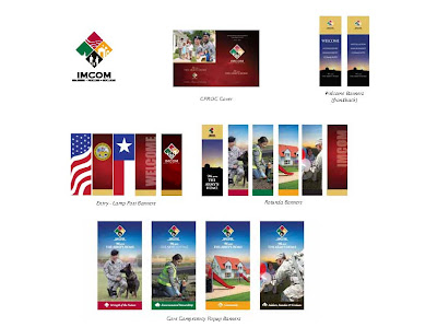
The second phase of the AFC material took a turn for a more patriotic look. We were still trying to communicate family and strength in the covenant. Our inspiration came from materials we had created for a conference last year (pictured above).  The Installation Management Command’s tagline is “The Army’s Home.” The overall look for the banners that were created had the sky in the background mainly to communicate a bright new future for the command.  The sky is what carried over to the second phase of the truck wrap and the new AFC brochure. I added the American Flag in the background and kept the images of the family, concept from our original AFC look.

As always I’m interested to see what direction is chosen.

Sunday, February 27, 2011

Soldier Show Materials

I am blogging this week about a project that I was assigned and I have not started the creative process other than a little brainstorming and research. 
Usually my boss designs “The Soldier Show Program” and promotional materials but with so much being put on his plate he asked me to take it on this year. The theme for this year’s show is “Carnival.” A poster was provided (pictured) to give an idea of what the Army Entertainment Division is envisioning. As you’ll see it is somewhat of a vintage look.  The old paper and the distinctive display typeface is probably what I will use for one of the versions that I provide for direction. I have been asked to provide a minimum of four cover options. 
In the beginning of a project there are two things that I do to get ideas. I research the subject. Get down to the basics.  I usually go to the dictionary to see how it’s defined and what other words relate to the subject at hand. Carnival is defined at dictionary.com as “a traveling amusement show, having sideshows, rides, etc.”. Merriam-Webster has festival and celebration as a couple of the synonyms for the word. This information I’ll use to determine the best visuals. I’ll also search on the internet or even go to the library to see what else has been done for other carnival program covers and materials. Please don't misinterpret my research. I look for how other designers chose to approach the same subject but I would never recreate their creation. One of the names that stands out for me through the little brainstorming I’ve done is Cirque du Soleil which is a “dramatic mix of circus arts and street entertainment.” This company in my mind sets the standard for this type of entertainment. The way they put together so many aspects such as costumes, music combined with acrobatics is absolutely breathtaking. How else do I say this is what I am using as an inspiration to develop this piece? It will be a starting point. Let's just see if it will make the cuts. I’ll be sure to share with you as this project progresses.
Link to Cirque du Soleil site

Saturday, February 19, 2011

"The Customer is Always Right."

I  received direction today on the Fiesta Medal which was the focus of my blog on February 4th.
Believe it or not, the choice was not even a version that I submitted. The decision was to use the medal created last year and just change the date to 2011. I didn’t create this medal but I have the logo to set up the file.
This reminds me of other projects that I feel took a wrong turn. Of course that’s my opinion. As I mentioned in the earlier blog  “ in the end it isn’t my choice.”  I wanted to share a few other projects that fell off the deep end. But I’ll spare you and just share one.
First, let me add the images of last year’s medal and the one I preferred.

Six years ago, I was contracted to develop the materials for a United Cerebral Palsy fundraising campaign. The campaign’s theme was “Tapestry of Life.”  The logos went through so many versions from a diamond shaped cloth look to a silhouetted tree symbol inside an solid color oval that flowed out into the negative space. The client was attached to using the images taken of the people that benefitted from their programs.  Most of the time, I would say that’s the way to go because it is more compelling to see images of people. It gives a warm inviting feel which we used on the brochure. But I didn’t agree that the images needed to be used  in the logo. This type of logo is difficult to reproduce and has other limitations.  The logo I preferred was symbolic of fabric threads interlacing. This could be used on promotional items and had more flexibility on the sizes that it could be used without losing readability. The word, tapestry is what inspired me to create the “preferred logo.” I envisioned the interlocking strands in fabric that were symbolic of the many people that touched and made UCP what it had become in the City of Birmingham.  (UCP logos included below)
But in the end the client was happy and that’s what is important.

Sunday, February 13, 2011

Heritage

Writing about the Fiesta Medal last week gave me the idea for this week’s blog.
The Fiesta Medal was inspired by the chosen Fiesta Poster for 2011. The San Antonio Fiesta made me think of heritage and culture. I have a couple of projects that were inspired by my own heritage. The most recent is a bilingual child’s book about an adventure of a little girl named Gabriela. Her grandmother she calls “Abuela” gives her a magical ring for her fifth birthday. Now that the ring is in Gabriela’s possession she begins to have dreams where a little tree frog called “Tito” takes her to the island of Puerto Rico. She always enjoyed her grandmothers’ stories about her homeland and now she gets the opportunity to visit and experience this place for herself.


In the book, I used many symbols known for the island. The tree frog is called a “Coqui” it is only found in Puerto Rico. They say that people have tried to take them to other parts of the world but the frog never survives for very long. I also had Gabriela experience Puerto Rican foods and the island’s hospitality.
My illustration for the book was a cut paper style yet created with the computer. I discovered the medium of cut paper while studying for my bachelor’s degree. I developed the style when I decided to create a Puerto Rican Dance Company that traveled to schools around the United States teaching about the island’s culture for my senior project. I developed informational brochures, posters, newsletter, bookmarkers and calendar. At that time, the entire project was created with cut paper and given the tropical Caribbean look using colors and images.
In 2007, I decided to try to recreate the poster using the computer software Adobe Illustrator.® Take a look at the image, so you can see the before and after.

My inspiration about my heritage comes from my parents they were born and raised in Puerto Rico and they have always instilled in me to never forget where I came from.

Friday, February 4, 2011

Fiesta 2011 - "Souvenir" Medal

This week I had a project that I had completely forgotten about until my boss asked me about the status. “Ummm, I’m glad you mentioned it because that one had gotten away from me, sir.”
I explained that I had a few revisions to make on the truck wrap layout and then I would “start on it.”
The project is a Command Medal for Fiesta 2011. How could I forget it?! This project allowed me to be a little more creative. Or maybe it was not having to use Army Green or Camo that was so appealing.  What inspired the options that I submitted? There were several things. Of course, the City of San Antonio’s landmarks, a coworker’s collection of past medals and finally, the 2011 Fiesta Poster. 
The poster is the one that inspired my favorite option of the four that I provided. It is the one I’ll share here.
I’ve provided a link to the Fiesta poster and an image of the medal option so it can be compared.  I used the round wreath look that the poster has and added ribbons at the bottom which gives the medal more dimension. I love the way the artist used the ribbons to symbolize the water from the riverwalk. Using bright colors was another element that I utilized to help depict “fiesta “. To distinguish San Antonio I included the Alamo and the tower in the center. A requirement was the use of the command logo which I placed above the wreath. The other options provided the usual Army image. Yet there was an option that I included where I used the flag, family, environment and community icons from the IMCOM logo within the shape of the state of Texas. I wouldn’t mind if either design is chosen.  In the end it’s not my choice.

Saturday, January 29, 2011

Army Family Covenant Campaign


My first blog took a while to get its title. I finally settled on “What Inspired Me?” I believe it will be interesting to take note of what sparks the design. Hopefully it will also make other designers become aware of what makes their design come together. It will show what is surrounding an individual that affects their vision and initiates the direction of the project.
I am presently working on a design for an 18-wheeler; it happens to be the third round of the first truckwrap created for the Army Family Covenant (AFC) Campaign which was done over a year ago. The first design that I created is the one I’ll share at this time. The new project is still in progress and still waiting for that spark to happen … I think I’m close but not there yet.
The marketing department was given the project of promoting the AFC message to make the soldiers aware of the Army’s commitment for improvements of their programs. The materials were to be used as tools to solidify the AFC Campaign message to the soldiers and their families. A few items we created were an informational brochure, ads, posters, outdoor banners, large static posters, pop-up banners and web banners pop-up display, tent and truckwrap. (Images included)  Our marketing representatives traveled to the different garrisons to deliver the message.


We determined that the materials needed to have a sense of warmth, we decided to give personalize by using actual Army Families for the images along with their quotes about the programs they had experienced. We needed a way for our audience, the Soldiers, to identify with the campaign and take the time to learn more about the message.
Our team (marketing account manager, photographer and designers) decided that the best way to depict this friendly and inviting feel was by giving the material a family album “look.” The photography taken for the campaign was portrait shots of the Army Families that volunteered. The Army Camouflage and color green was included in the layouts to specifically identify the material as Army, along with the ARMY Strong logo.
The truckwrap was one of the last pieces to complete the campaign. On the truck layout the idea is to get a quick message to the moving viewer so less copy more visual on this and a couple of the other layouts we did have to fall back on the use of some stock images to have diversity.
Take a look at the link you will see the process of the truckwrap being put on the truck itself.