Sunday, March 27, 2011

Part III: Soldier Show Material


Original Version #7
The Soldier Show Saga continued this week. My supervisor’s boss gave me a call on Monday and she asked me “Why did we not provide the version that the client preferred the most?”

2011 Program Cover
I said “I’m confused about that myself but that is the guidance I was given.”  She told me to revisit the #7 version (pictured) and resubmit. The other feedback we received from the client was that they wanted blue to be the prominent color since last years’ was red (shown on the right).
I made the revisions and resubmitted three more versions (pictured below).  We are still waiting for a response and the timeline is getting short. I still have the poster and the layout of the program to but together. The first show is April 22nd; I believe it’s in Washington, DC. We expect to have direction by next Wednesday.

I have dabbled a little on the idea of what to do for the inside pages of the Soldier Show Program. It is a half letter layout so the pages do not allow for too many elements before it becomes cluttered. I am planning on using the stage design as the inspiration and use elements from the cover designs.
Another project I have is the material for the “Association of the United States Army” Conference that is coming up April 18 – 21. It will be held in downtown San Antonio. Thankfully the visuals have already been created it is a matter of reformatting them for the materials needed; several large banners and a tradeshow booth which comes to about 21items total. Luckily, I’ll be sharing the task with two other designers. I’ve also been asked to give two talks for the conference’s design and marketing sessions. It should be interesting and it is an honor to be asked to represent our creative services team. But In order to accomplish this I need to have a presentation put together and could use the time to prepare. 

Sunday, March 20, 2011

Part II: Soldier Show Concepts

I was given some direction this week on the Soldier Show Poster. I was informed that the client preferred posters #3 and 7. But #7 had the most votes.  Apparently the show has a circus-like appearance but they really didn’t like the idea of really showing any “personalities.” At least not the way I depicted them. The client wants more of a feel of the circus without showing anyone. At least that’s what I understood.


What is confusing is the following guidance that I received. I was instructed to modify #1, #2 and #6. The client didn’t pick any of those.  Number 1, I was to switch out the background of the first option with the one from #6. Number 2, I needed to change the silhouette of the ringmaster. The feather did not go over very well neither did the glasses which I was able to change. Number 3, I also had to create the versions as a cover design without all the text that the poster includes. Hopefully, this change would allow the client to get a better idea of the direction.  

My original idea was to get a “Cirque du Soleil” look and feel but honestly I don’t know that I’m doing the project justice at this point. When these “high profile” projects come up a parade of people have to be involved. This usually just complicates the process.

One of the benefits of this project unlike some of the ones I work with is that it does have a timeline. The Soldier Show's first presentation is at the end of April so we are rushing to get our approvals on the materials necessary to provide to the Installations. We will create print ads, electronic ads, posters and the show program.

You can see below the last three that were forwarded the first and third are very similar because of the same background. And so the process continues . . .


Sunday, March 13, 2011

Soldier Show Poster Concepts

This week was just as busy as the last one. Basically, it was another week of juggling multiple tasks along with the “walk-in” requests.  We call these ‘drive-bys,” because people come in and drop off stuff to be done and leave. Unfortunately, they are usually needed within a short timeframe.
Our main focus for this week was to work with one of our contractor web designers from our Virginia based team to learn how to maintain several of our websites.
A few other tasks to accomplish were to finalize the mandatory training, pass the exam and to provide at least five drafts of the Soldier Show Poster. The show’s theme this year is “Carnival.” I couldn’t wait to have the time to develop this project.  I wanted to get started last week. As I mentioned in my blog a couple of weeks ago my idea was to create something inspired by the look and feel of “Cirque du Soleil.” Part of this became difficult when we found out that the cast didn’t have the costumes ready for our scheduled photoshoot. We didn’t have much choice considering the timeline but to go ahead and get headshots of the cast. I wanted to use images of the soldiers in costume. In “Cirque du Soleil’s” look they have a ‘focal character” with bright colors surrounding them. I brought in the use of bright colors and a play with the type. I feel like I could develop the typography more.  My goal at this stage is to get a general direction on the overall design. Then I can clean up and develop the chosen draft. I still used a focal image but it wasn’t exactly what I wanted to use because of our limited selection of images. Since this has to do with a show using a stock image to portray a character would be misleading. So, I used images where the faces weren’t distinctive.
The drafts have been sent to the Army Entertainment team for their feedback. We may be instructed to use one type treatment with another image and so on. Needless to say, we wait.
You can take a look at the thumbnail image of the concepts I provided. 

Sunday, March 6, 2011

Truck wrap Update (3rd Phase)

It has been extremely busy. We have a training that our leadership has required of us, it takes 20 hours minimum to complete. In the Marketing Directorate we are pretty well spread thin we really don’t have much time to slow down to do this training. At the moment I’m taking two classes for a web certification, I’m dealing with the requirements at work and the demands of having a family.
This week I was listening to the training on one computer while I designed on another.   I call it “ULTIMATE MULTITASKING”. It’s stressful. In the mist of this the top projects are all at a crucial milestone.
I finalized the options of the truck wrap that our team wants to present. It was sent for approval within our command for direction before it is shown to the General. We chose to present two sets (pictured).

One version is “Universal” it covers several of the Family MWR programs all on the one truck. This really wasn’t what the boss asked for but we wanted to provide it as an option. The second is program specific; each truck has one particular program as its focus. When the General saw the second version (pictured below) of the Army Family Covenant (AFC) truck he decided that we needed to take the opportunity to showcase some of the programs that we provide. We decided to depict the programs through the brand marketing has already created for it. (An example is the “Survivor Outreach Services” Ad pictured on the right.)
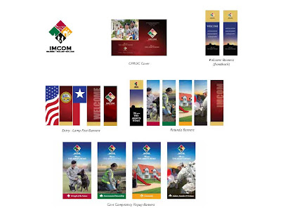
The second phase of the AFC material took a turn for a more patriotic look. We were still trying to communicate family and strength in the covenant. Our inspiration came from materials we had created for a conference last year (pictured above).  The Installation Management Command’s tagline is “The Army’s Home.” The overall look for the banners that were created had the sky in the background mainly to communicate a bright new future for the command.  The sky is what carried over to the second phase of the truck wrap and the new AFC brochure. I added the American Flag in the background and kept the images of the family, concept from our original AFC look.

As always I’m interested to see what direction is chosen.